Final Project: The Battle
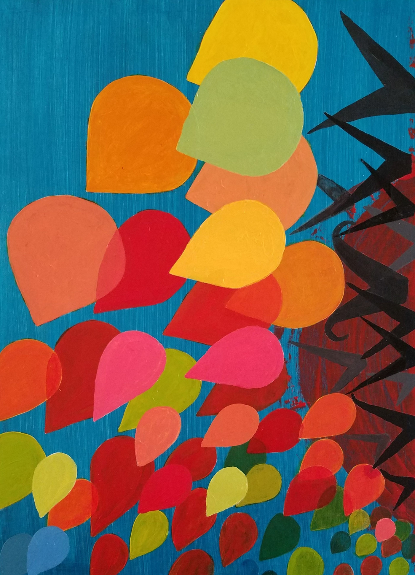
Final project. Extreme up-close shot reveals edges of bubbles. It was very challenging to cover round edges during layering of paint. All techniques were employed in this final piece: scale, translucency, color, overlap, and proximity to show depth. In spite of imperfections noted on computer screen, final piece looks amazing from a short distance away in natural light conditions; it shows its true, rich color.
The story depicted here is:
"Good will be conquered by evil. The loud, violent "mouths" (attempting to disrupt the peaceful bubbles) were swiftly quieted by the warm, more resolute bubbles."


Final piece with and without border. The canvass was mounted on foam board.


The composition was done on an 18" x 24" canvass using acrylic paint.
This is the work in progress: white charcoal pencil was used to outline shapes.
In this final step of the process, we were challenged to depict our "armies" in a battle setting according to their inherent abilities.
Exercise 3: Transparency illusions and metaphoric representation
In this study, we were tasked to create two distinct composition using 18" by 24" canvas sheets. We were to incorporate the various techniques explored thus far, and adding illusion in order to create a metaphoric representation of words.
The two sets of words I was assigned to represent were: Rising/Resolution and Violent/Communication.

"Rising/resolution" vs. "Violent/Communication"
Here are the two pieces joined together and forming a diptych. The story being told is that violent communication is oppressive and chaotic; left to fester, it has the potential to cross over and disrupt other surrounding, more peaceful communities.

Close-up of first piece. The techniques I used to create depth were scale, overlap, color temperature, and translucency. Because I wanted to convey a message of resolution (both in the ocular sense and solvency from conflict), I blurred the edges of the bottom pieces (and some towards the middle) in an attempt to create a muddled, chaotic or oppressive origin. As the bubbles expand/rise from their confine, their appearance gets clearer and more defined.

Close-up of second piece. The techniques used on this were scale, overlap, color, and a bit of translucency. The message I tried to capture was violent speech being shouted at the crowded minority by the larger, more imposing figures. The crowd, although more numerous, appear feeble and insecure. They are being bullied and intimidated to the point of retreat. Such is their boldness, that one can be seen attempting to "bark" at their neighbors!


Rising/Resolution: beginning stages of my first set of words. The idea I was trying to capture is that of bubbles attempting to release themselves from a very dense and confined space.
(The tissue seen in first image was used to prop thread up so it would not smear fresh paint underneath.)

Violent/Communication: second piece in the works. My intent here is to portray a multitude of "mouths" shouting at each other.
Exercise 2 Space through color and atmospheric perspective
In this exercise, depth was studied using color temperature change: two chromatic studies, and two grayscale studies on 9" x 12" canvas using acrylic paint.

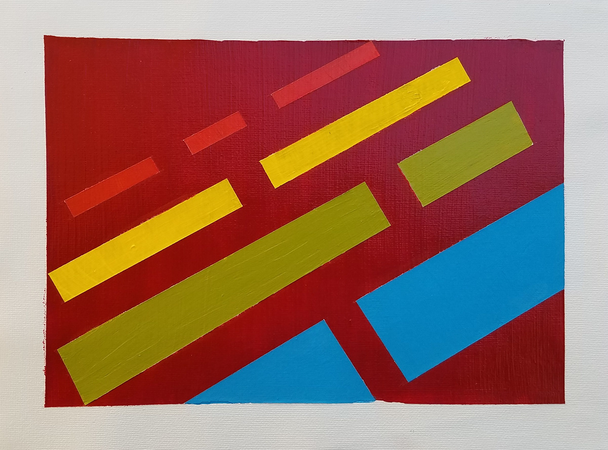
This richly-colored study is one of my favorites! I believe the color choices to capture depth worked! The slight translucency of the pthalo-hued background under the red blocks, helped create a sense of "shallow water" underneath. As the background gets darker and recedes (towards the top of the frame), the more sense of depth is created as the bars are seen sinking into the blue abyss.
This chromatic study was super fun to create! I kept the same pattern as previous study hoping to capture depth in warm colors; however, I noticed this was not as dramatic as I had hoped. I believe overlapping a few pieces would have enhanced the feeling. Nevertheless, it turned out beautiful!

This was a challenging piece as the tape ripped off the paint when lifted! Attempts to touch up background was somewhat successful, but still noticeable when viewed up-close! I did not use the overlap technique to create depth on this piece; instead, I used scale and proximity to convey such. I believe it looks better when viewed from afar.
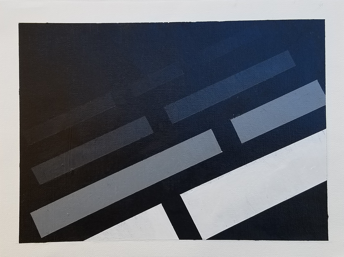
I really like how this one turned out. I used the same technique as the one above, but in reverse tonal order. I believe this one captures the feeling of depth more effectively, even when viewed up close!
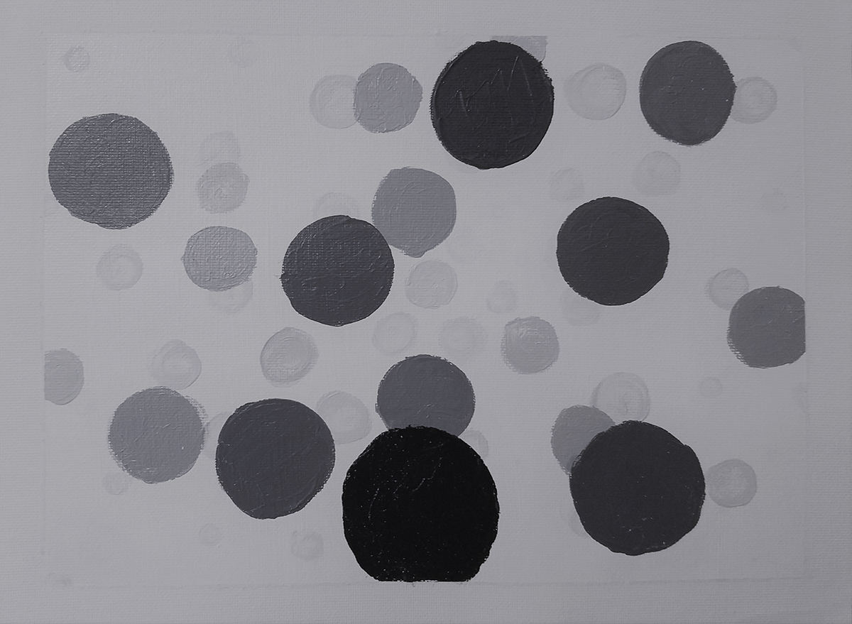
I tried to free-hand various circles with less-than-perfect results. I was aiming for a "bubbly" effect with the smaller bubbles fading in the background. I may try to do this again using round stencils to draw better circular shapes. Nevertheless, as crude as this may appear, I believe the feeling of depth was captured.

In this study, the techniques used were overlap, pattern, placement, and tonal variation. I believe this study successfully shows a "tunnel" effect as viewed through a window. Although I'm happy with the results, I now wish I would have experimented with a white frame so as the see the slit at the bottom pop out more. I believe this falling sensation was due to the repeated, descending pattern, and gradual tone variation from light to dark.


I couldn't help, but play with different angles! This piece lends itself to optical illusion when viewed through different filters (this one is called "Zeke" using cell phone camera).
Exercise 1: Spacial Investigation: Overlapping, Scale, and Value
In this exercise, we were tasked to communicate depth using black and white colors only (or any shades in between). Five studies were composed using various techniques to achieve this goal. All five studies were done on a 9" x 12" canvas using acrylic paint.


The techniques used to convey depth in these two studies were scale, placement, and color (tonal) variation. I took advantage of the idea that darker, larger objects placed closer to the bottom tend to convey closeness; whereas lighter, smaller objects placed near the top, tend to convey distance. Also, darker objects appear to feel heavier than lighter colored objects.


The techniques used in these two studies were overlap andvariation. In my opinion, placement was not that crucial in order to convey depth. Although descending color tonality was employed (as in previous two studies), I now realize that deviation from such would not have altered the result; quite the contrary, I believe it would have dramatically enhanced the layered effect, and perhaps, added more depth.

This grayscale study was fun to create; however, the only change I would make is to continue the lines until it touches the right and bottom edges; this way, a deeper sense of depth could be perceived. (Line sharpness was a challenge for this piece.)

